Mirror | Clothing for Everyone
Mirror first opened its doors in 1994 with a mission to make any type of clothing accessible to everyone. With over 400 stores around the world in 32 countries, it’s safe to say that the company has grown tremendously over the years. Yet, as much as the customers praise the brand for its low costs and clean storefronts, there has been an equally frequent voice of frustration in the lack of a digital presence.
I lead the project in bringing their platform online so that Mirror could better meet their users needs and to sell their products more efficiently.
Responsibilities
Research, User Flows, Information Architecture, Sketching, Wireframing, UI, Prototyping
Timeline
June to July 2019
Key Outcomes
Responsive ecommerce website that allows customers to browse through all products and use filters.
Logo Design that would encompass the brand goals to be viewed as modern and neutral.
Step One: Research
Research Plan, Secondary Research, Provisional Personas, Competitive Analysis, and User Interviews
Fashion eCommerce is nothing new. It's a standard for any major clothing brand to have an online site. Still, I must admit that I avidly avoid making purchases online when it comes to clothes. Too many wrong sizes and scratchy textures have long since steered me away from such purchases. Knowing that I hold a very biased personal experience, I set out to even the playing field by diving deep into research to get a better understanding.
Research Goals
What motivates customers to shop online?
What pain points do users currently have shopping online?
What preferences do users have when shopping online?
What are the market competitors currently doing with their platforms?
Competitive Analysis
With an array of competitors, both direct and indirect, I thought it would be worthwhile to learn what they were doing well and which areas could be improved. I studied up on brands that catered to similar target users as Mirror. Through research, I also found that there are industries that are starting to be more prevalent in the ecommerce space such as online consignment stores and fashion subscription services. Understanding why these new fashion industries are becoming more popular helped me better understand what drives users to their companies and sites.

User Interviews
There is a lot to learn from competing brands, given that there are many established industry standards. However, it was important to also get a better understanding of the user side. I spoke to six people who varied in their comfort and experience with shopping online. During these 1:1 interviews, I wanted to better understand the experiences that people have had shopping, either online or in store.
I feel like I’ve won something when I get a good deal during a sale.
Goals
- Purchase clothing at a good and reasonable price.
- Purchase clothes that suit their style and fit the occasion.
- Be able to purchase clothes that are a good fit on them.
Frustrations
- Prices that are too high, whether the product or fees.
- Not being able to find a style or item that they like.
- Clothes that don’t meet their expectations when they get it in person.
Needs
- Stores with affordable prices, sales, and/or free shipping and returns.
- Variety of selection that caters to styles appropriate for differing settings.
- Accurate and easy way to know their size.
Step Two: Define
User Persona, Empathy Map, Storyboard, Card Sorting, Sitemap, Project Goals, Feature Roadmap, Task Flow, User Flow, and Product Requirements
User Persona
Using my interview findings, I created Anya to help me understand how I can help her/our users achieve their goals whilst browsing Mirror. Anya King represents an age and and archetype that is representative of a large percent of those who currently shop for clothes online.
Sitemap
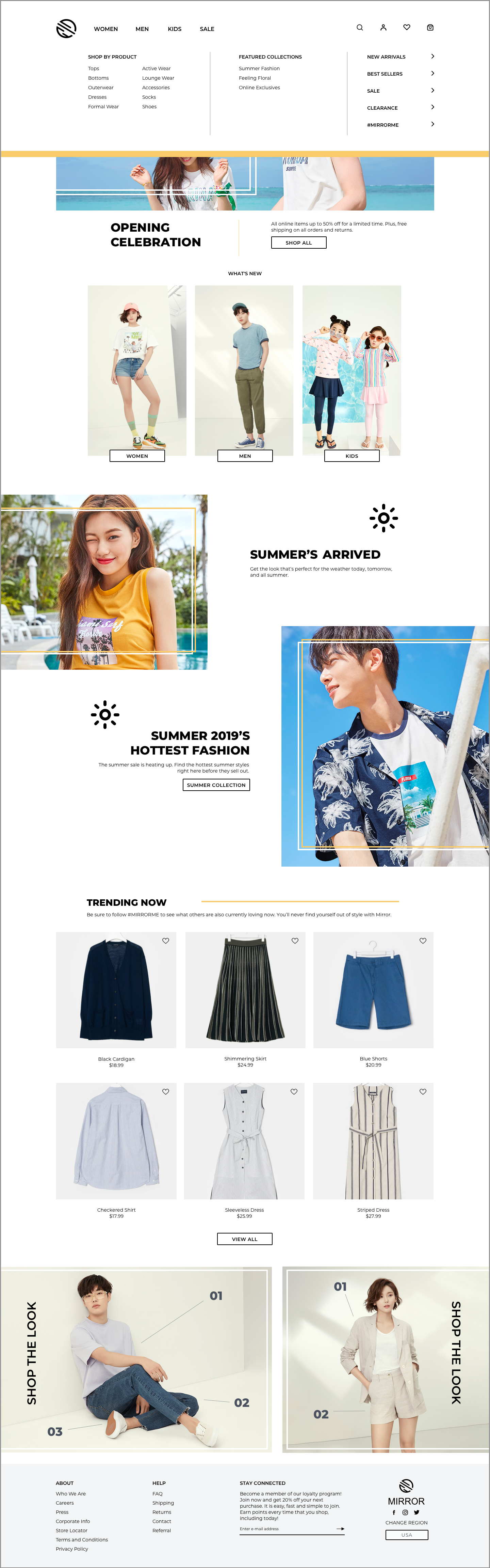
Once I had a better understanding of the target audience and some of their needs and frustrations, I shifted gears to work out what major features would need to be built into the website. Through a combination of industry standards and a card sorting exercise with users, I decided on using women, men, kids, and sale as the main navigation links. After mapping out the major features, I was then also able to figure out the hierarchy between them and the minor features.

User Flow
Previously, I had worked out which pages and features would need to be built out. The next step was to work out the process and how a user could interact with all the pages. I built out two potential scenarios for my user flow that Anya could take.
01.
Make a Purchase
The first one addressed a situation where she decides to purchase some clothes for a particular setting. As it is the main goal of the company to have users purchase, it was important that I built out this process without any dead ends.
02.
Favorite an Item
The second user flow follows how she could save/favorite an item while she was casually browsing through the selection. My interviews with users made me realize that people do the equivalent of window shopping online. As such, I wanted to figure out a way where they could save items while doing so.

Step Three: Design
Wireframes Sketches, Responsive Wireframes, Moodboard, Brand Style Tile, Logo Design, UI Design, and UI Kit
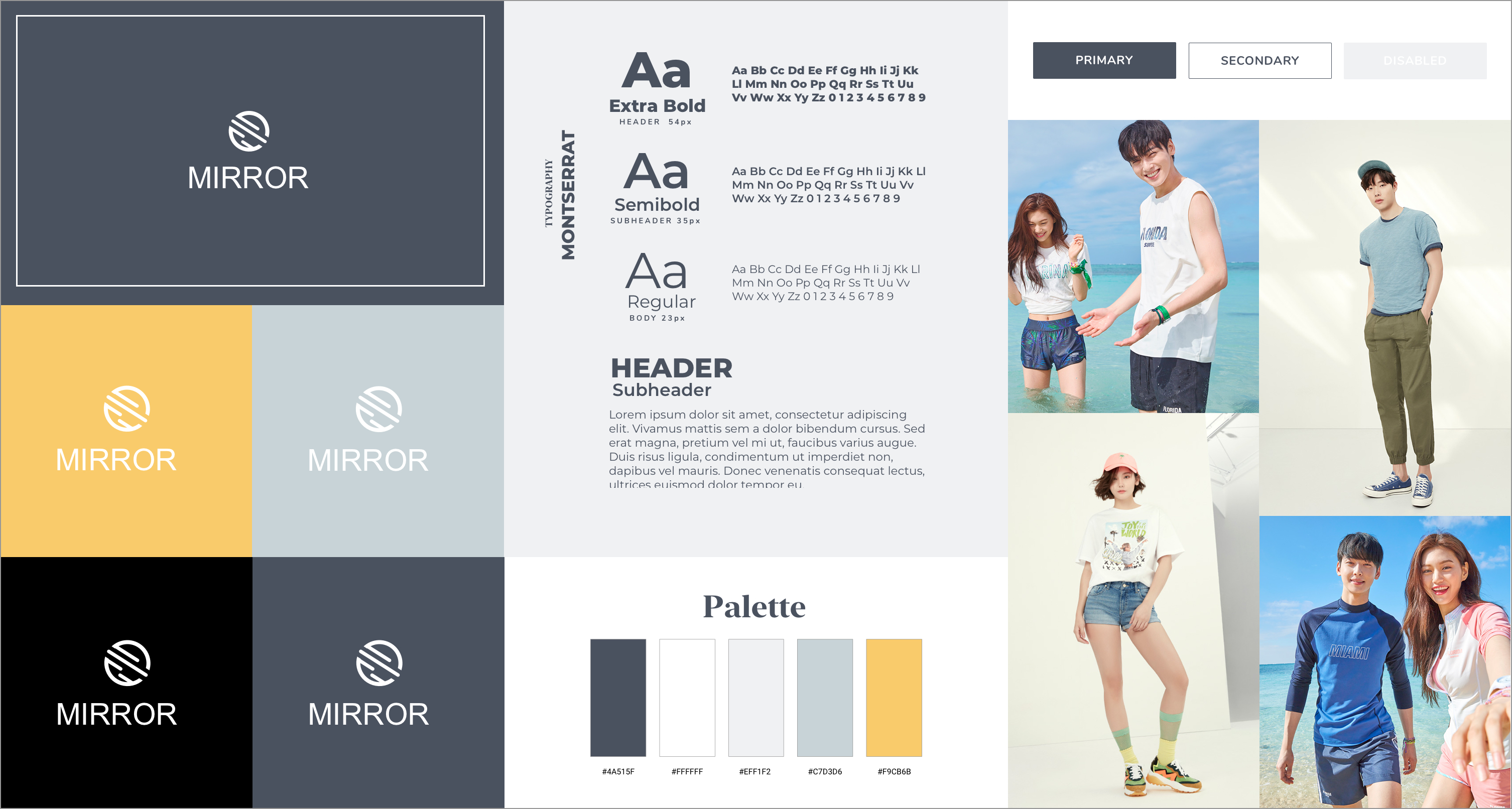
Brand Logo
Mirror wants to be viewed as neutral, modern, fresh, clean, and clear. So for each step in the process of deciding on the logo, fonts, colors, and etc, I made sure to constantly reference back to their goal.
In creating the logo, I played with the idea of circles, reflections, clothes hanger, and more. A few iterations focused on the typography, whereas others were designed with a heavier focus on shapes. I tried out ideas with the full name and also just using the letter M to represent the brand.
After trying out a few digital concepts, I tested out different fonts and placement to achieve the look that I thought would best reflect the brand. The logo that I finally decided to move forward with emulates a circular mirror with a reflection shining off of it.
Brand Style Tile
A style tile was created in order to bring together all the elements of the brand. From showing the logo against various backgrounds to the style of photos used in the banners, the main visual components are gathered here.
Colors are used sparingly throughout the site as the photos of the products are meant to be the main focus of each page. When needed, a gold color is used to draw attention to a specific action that is desired.
Montserrant is the font that is used throughout the website. The sans serif font is easy to read for users and the variety of weights permits a visual hierarchy that is distinct.
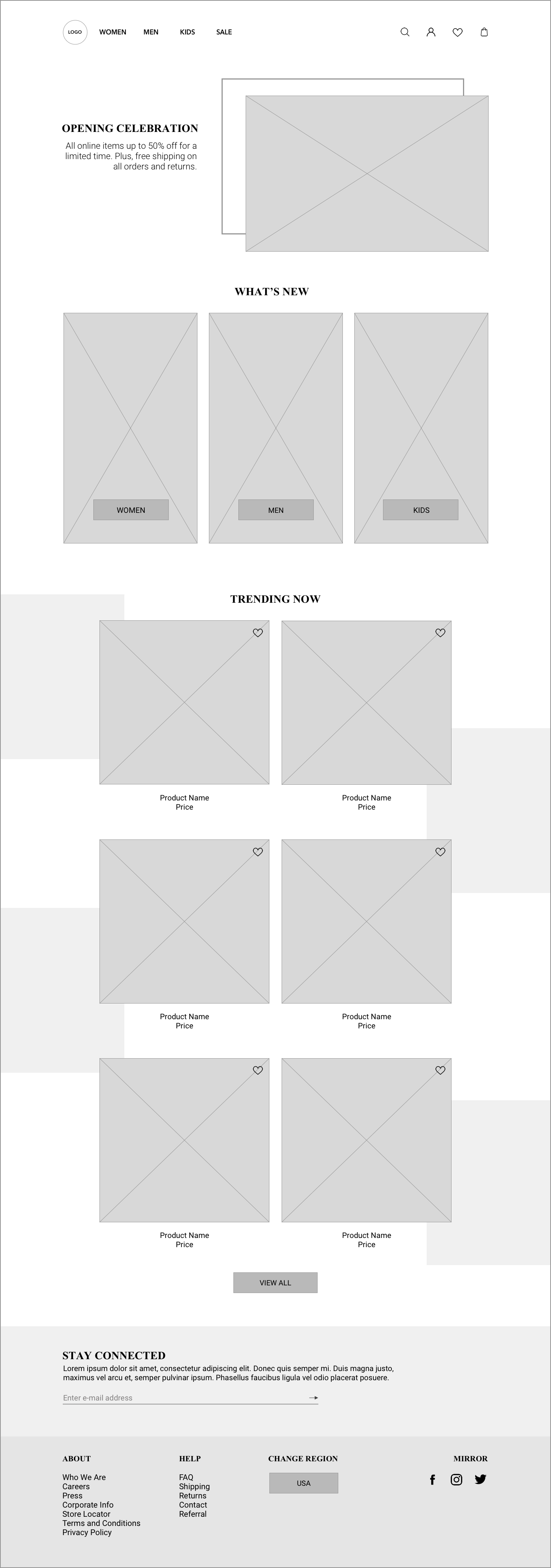
Wireframe Sketches
To brainstorm visuals solutions, I set out sketching potential layouts for how the homepage could look. I considered design patterns that are often found in sites that are similar to Mirror. I also considered what my users would most want and need, such as having plenty of photos so that they know what to expect with a product.
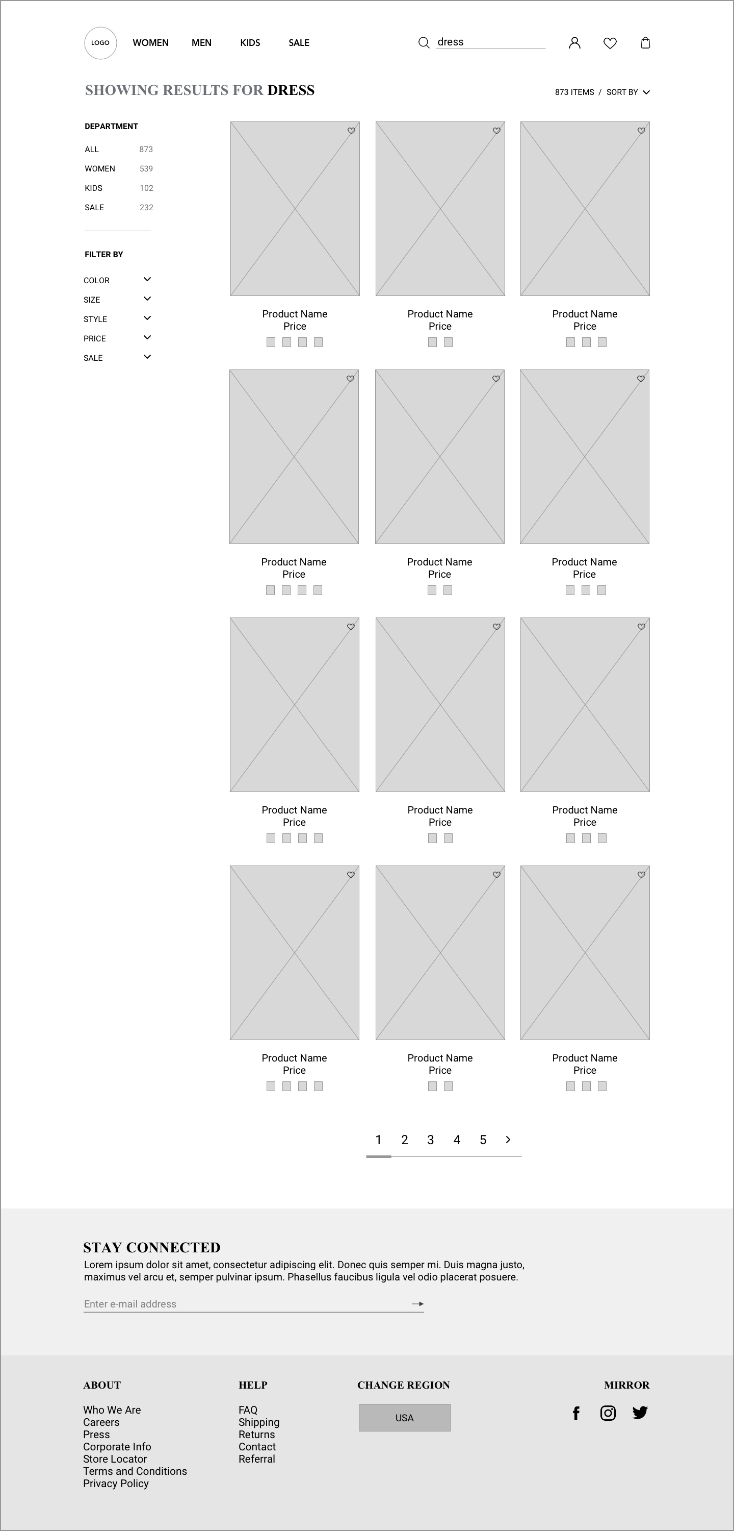
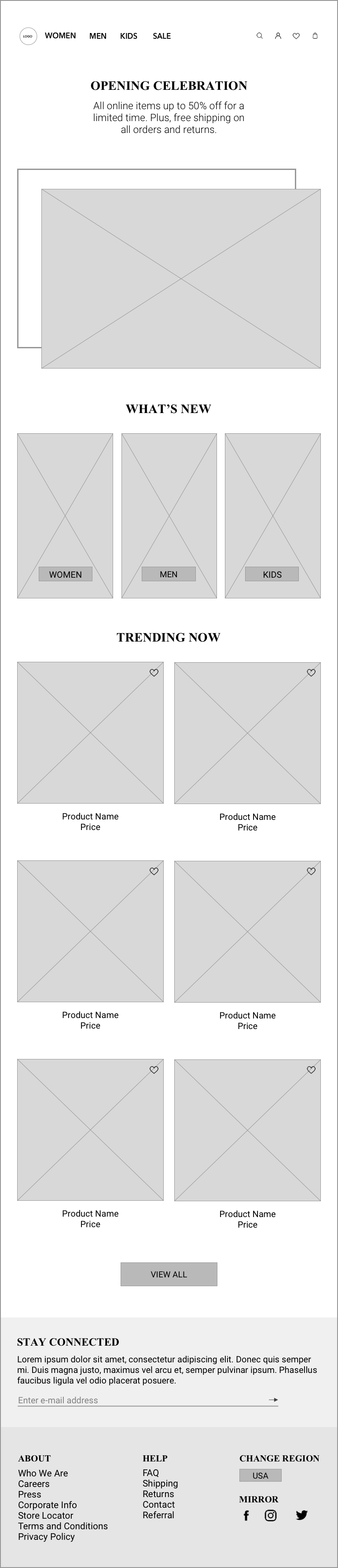
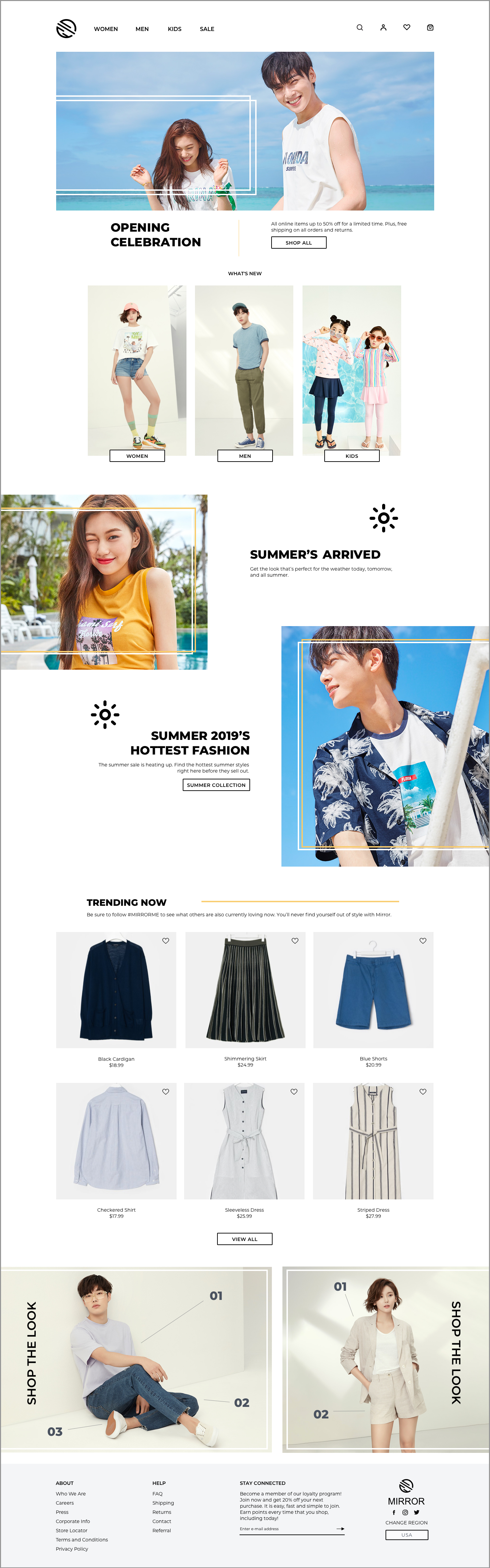
Wireframes
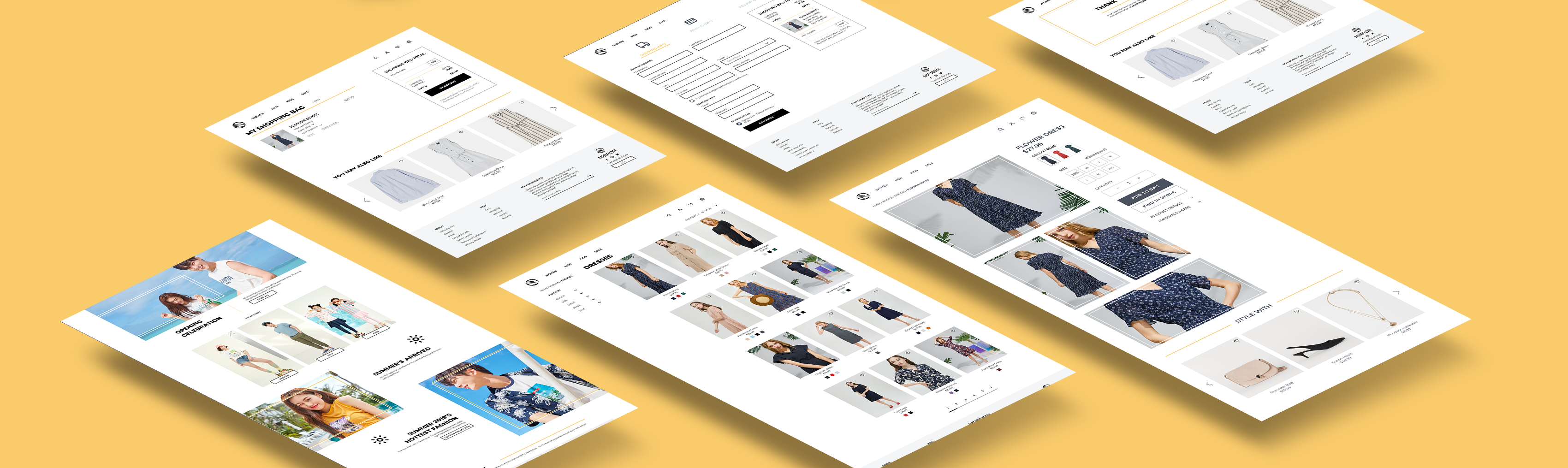
Task flows and user flows helped me refine key features and their interactions. From there, I was able to begin working on a set of mid-fidelity wireframes that would bring to life the flows that I created. I designed the pages that were necessary to the process such as the home, search feature, search results, category page, and product page. As my goal was to create a responsive website for the company, I also built out what the site would look like through different screen sizes.
Final Design
Step Four: Test
Hi Fidelity Prototype, Usability Testing, and Affinity Map
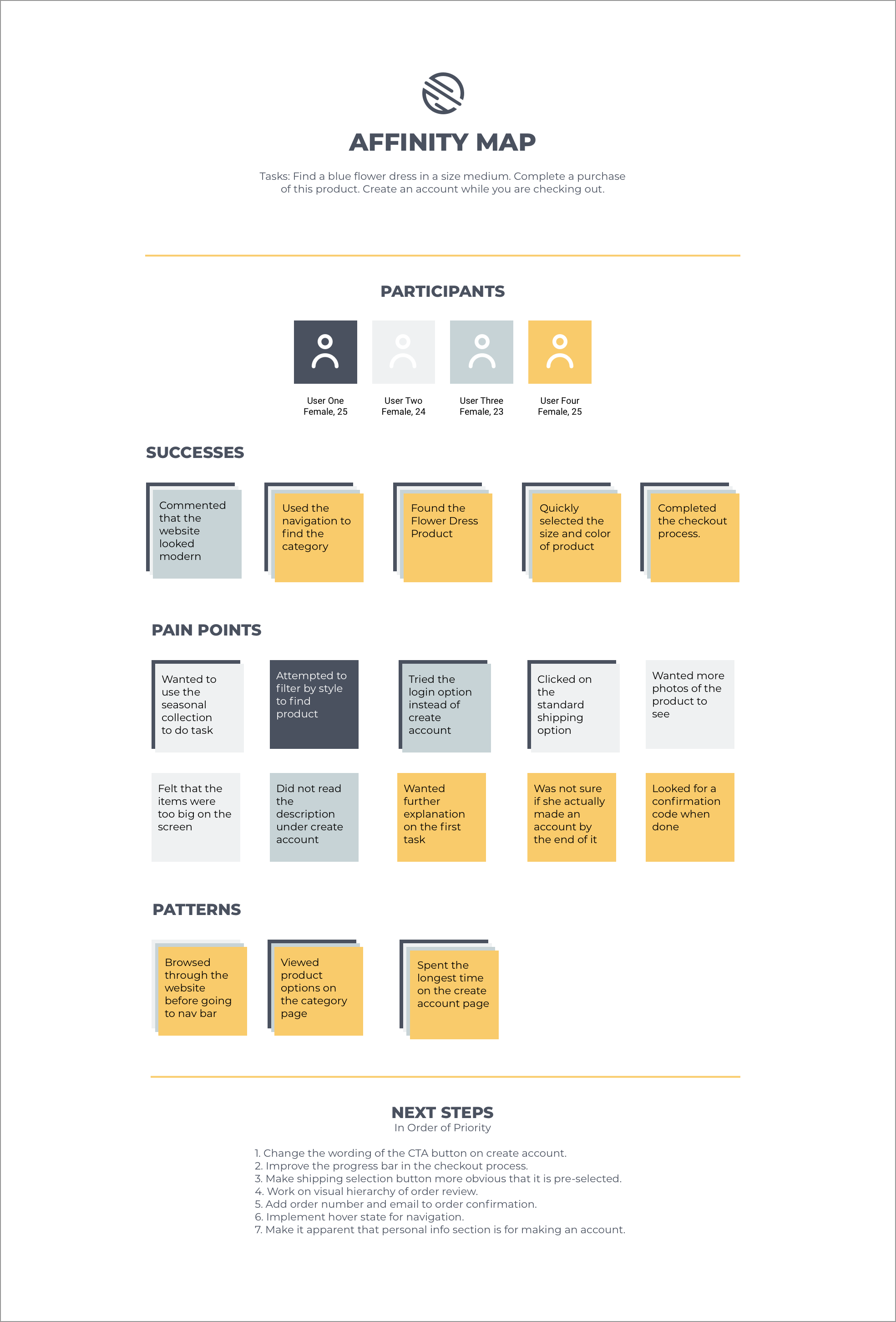
Usability Testing
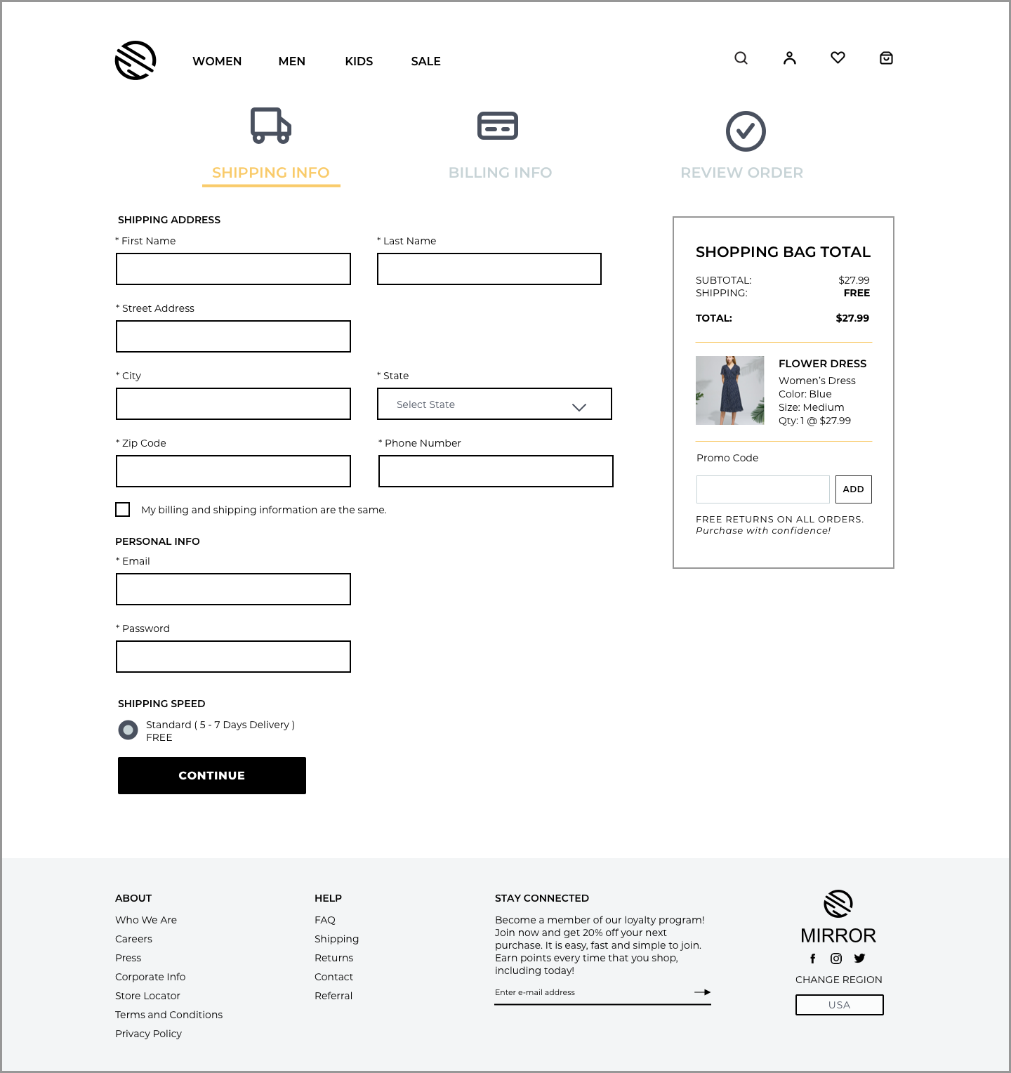
View Prototype ➔To test out the designs created, I built out a prototype using Invision. In total, I had 4 participants that were similar in age, gender, and interests as Anya, the persona. The test objectives for this round were to observe how users navigate through the site to search for a product, see if users can successfully create an account and complete a purchase, and identify pain points and frustrations in order to improve the flow and design of the prototype. To meet these objectives, I observed as users completed three tasks.
Task 1: Navigate through the website to find a dress with a flower print on it.
Task 2: Get that flower dress in the color blue and in a size medium.
Task 3: Complete your purchase and create an account while you’re checking out so that you can save time the next time you buy something on Mirror.
Overall, all users were able to successfully complete all three tasks. Participants described the overall design as clean and modern, which fit how the brand wanted to be represented. One common area of frustration among users was in the account creation. Moving forward, the account creation text in the CTA button needs to be designed better so that users can easily distinguish it against the existing member login section.
Affinity Map
Finding areas of improvement based on the usability testing was my next goal. In order to figure out which improvements to priortize, I organized my findings into an affinity map so that I could see where the trends and patterns are. Once I had everything visually laid out, it was easier to see what needed to be done next.
Reflection & Next Steps
Throughout this project, I set out to accomplish two main goals. One was to create a responsive eCommerce website and the other was to re-brand the company with a logo that fit the brand adjectives. Through empathizing, ideating, prototyping, and testing, I was able to accomplish each of these goals, The created solution even successfully saw a result of 80% completing the various tasks with ease.
However, there are always ways to improve a product. With the revisions made from the initial usability testing, it would be great to be able to continue to test the prototype in order to improve it. Once the success rate is higher, I would be able to hand-off the final prototype to the developers. Another feature that could be designed is a better way to allow users to figure out their best fit in clothing sizes. With so many users concerned about clothes not being the right size, coming up with an innovative way to ease that worry would be a worthwhile venture in the next iteration.
Other Projects